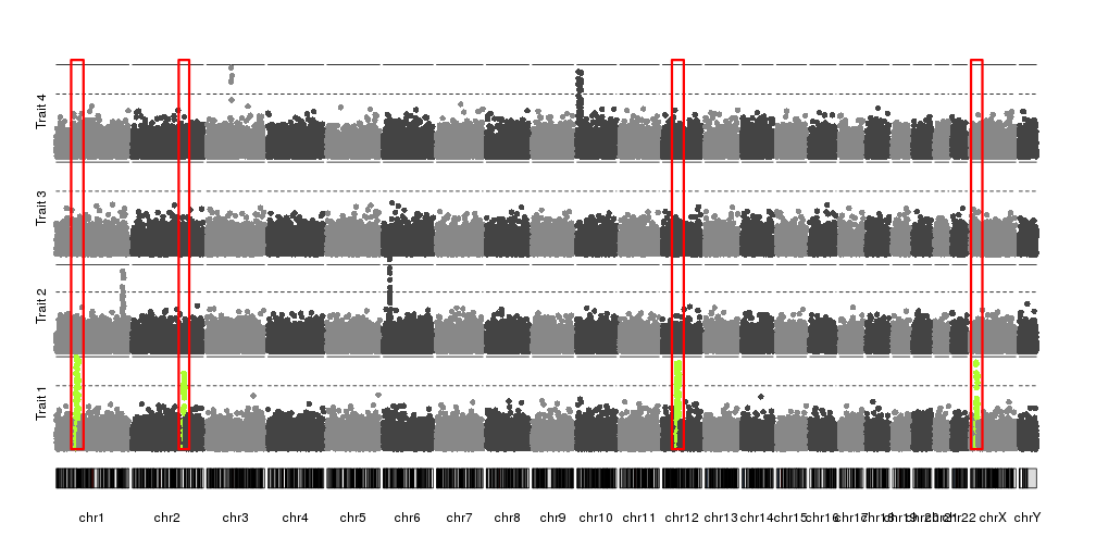
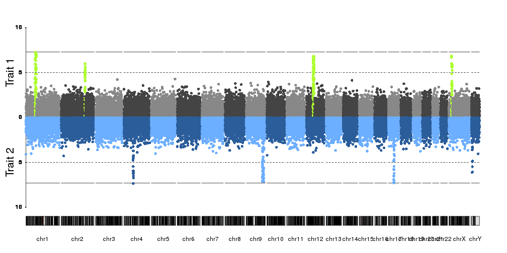
How can I stack several manhattan plots in the same plot looks like this https://imgur.com/a/pj40c using R?
That plot is made using excel and not follow their real map position.
In my case I have 4 p-values from 4 different phenotypes. They are estimated from same SNPs. I want to stack them in the same plot but distinguish phenotypes by different colors.
   # Input data format, example.
   SNP  CHR POS pval_1  pval_2  pval_3  pval_4
    a   1   100 0.1 0.5 0.2 0.1
    b   2   110 0.2 0.6 0.3 0.5
    c   3   120 0.3 0.7 0.1 0.6
    d   4   130 0.4 0.1 0.4 0.2
qqman is a very useful R package, unfortunately it is only allowed for single trait.


Thanks, I thought the same thing before posting my question. But I wonder that do you know how to create a column for CHR using my example data (for + facet_wrap(~CHR) usage ) ? Thank you.
Using the facet_wrap you'll split your graph in as many chromosome as you have:
With the facet_wrap() by chromosome:
http://hpics.li/3db6911