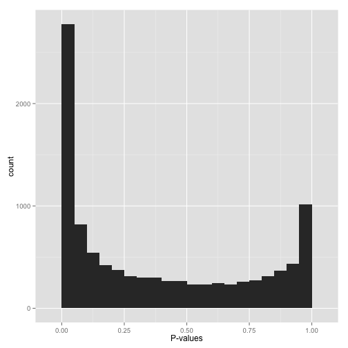
Hi everyone,
This is my first BioStars post, so please forgive me if anything about the question format is incorrect. I am analyzing a set of differentially expressed genes for GO category enrichment via GOseq. We conducted the differential expression analyses using Limma/Voom, and have one control group and an experimental group (3 replicates each). When I plot the p-values obtained from GOseq in R, I am obtaining a bimodal p-value distribution similar to the one shown in the attached figure. This is what I would intuitively expect, namely that some GO categories are significantly enriched (left side of plot) and others are definitely not, etc. (right side of plot). I looked up a few cases for the categories that had p-values in the 0.9-"1.0" range, and often times they only had one to a few differentially expressed gene out of hundreds or thousands of genes with that go category, etc.
However, now I'm at the point where I want to correct for multiple hypothesis testing using the Benjamini-Hochberg procedure, and have read that one should proceed with caution if the histogram doesn't follow the general monomodal "L-shape" showing an otherwise uniform distribution of the null p-values with a higher density of p-values near 0.0-0.05. Since mine is displaying a bimodal "U-shape" with p-value densities near 0.0 and 1.0, I figured that it would be best to get advice before going further.
I was wondering if there is a best next-step to take as far as my scenario is concerned, be it a correction method that doesn't assume uniformity near 1.0, etc.? I'm not incredibly experienced in this specific area, so if I can provide any more information, please let me know.
EDIT: I also realize now that an alternative solution to this problem is just to lower my α from 0.05 to 0.01, or lower. Across ~3000 tests, that lowers the proportion of false discoveries to 30 or fewer rather than 150, which I think seems more reasonable.
Figure by David Robinson, VarianceExplained.org


Hi, A nice explanation is given here http://varianceexplained.org/statistics/interpreting-pvalue-histogram/ . The right side could be due to lack of data. Having a cutoff before testing (like minimum number of reads could help) .
Hi microfuge,
That article is actually how I realized that this non-uniform distribution was an issue. I think that applying a correction when the values are non-uniform just makes the estimate more conservative from what I've read and simulated in R. Given that I'm comparatively okay with more Type-II errors compared to the same number of Type-I errors, I'll probably apply the methods as is since I don't want to do too much a posteriori database cleanup if possible.
Oh Sorry. I posted in a hurry and missed the last line specifying the image source. Makes sense.
No problem! That was actually one of the only websites that I could find that goes into any real detail on this issue. It kind of makes me concerned for everyone who has corrected a set of p-values for multiple hypothesis testing without checking the histogram.