Hi,
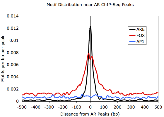
I'm trying to understand profile plots for motifs. Homer has a function annotatePeaks.pl) to generate motif density profiles that looks like following (lifted from here)

While I understand what these profile plots convey for ChIP-seq data (e.g. those generated by deepTools plotProfile), but I'm not sure what exactly is the y-axis in above plot.
So the question is, is it just the probability of finding given motif at each position (as MEME does here) in a set of given sequences or is it the actual count normalized to something?
I didn't find any explanation on homer website. It would be great if anyone can explain what exactly is going on in above plot.
Thank you.


Convert a BED file of motif positions to a bigWig with a 1 where there's a motif and a 0 otherwise and it's the same thing you'd then get with
plotProfileI think.I created a bigiwg ( using bedtools genomecov + kent utils) and plotted with plotProfile. The motif I'm interested in is has very sparse hits, applying loess fit on plotProfile output data is more/less looking closer to the above plot. I think I understood what's happening inside.