Hi all,
I've just finished a chip-seq analysis and I would like to represent the results in a nice way. I was thinking about doing a CIRCOS plot with the peaks detected. I've never work with CIRCOS, and it's my first time with chip-seq data, so I would like to know if anyone have tried to perform a circos with this kind of data, and how the plot looks like. I've read the circos manual from http://circos.ca/documentation/tutorials/, to have a general idea but I would like to focus on chip-seq data. Any help or plot examples would be really appreciated.
I'm planing to use circlize R package.
HOMER can also do CIRCOS plot for chip-seq. But it seems it can work only upon Paired-end data. Check it out here : http://homer.salk.edu/homer/interactions/circos.html
Maybe you want to try shinyCircos. It's an interactive APP. https://github.com/venyao/shinyCircos http://shinycircos.ncpgr.cn/
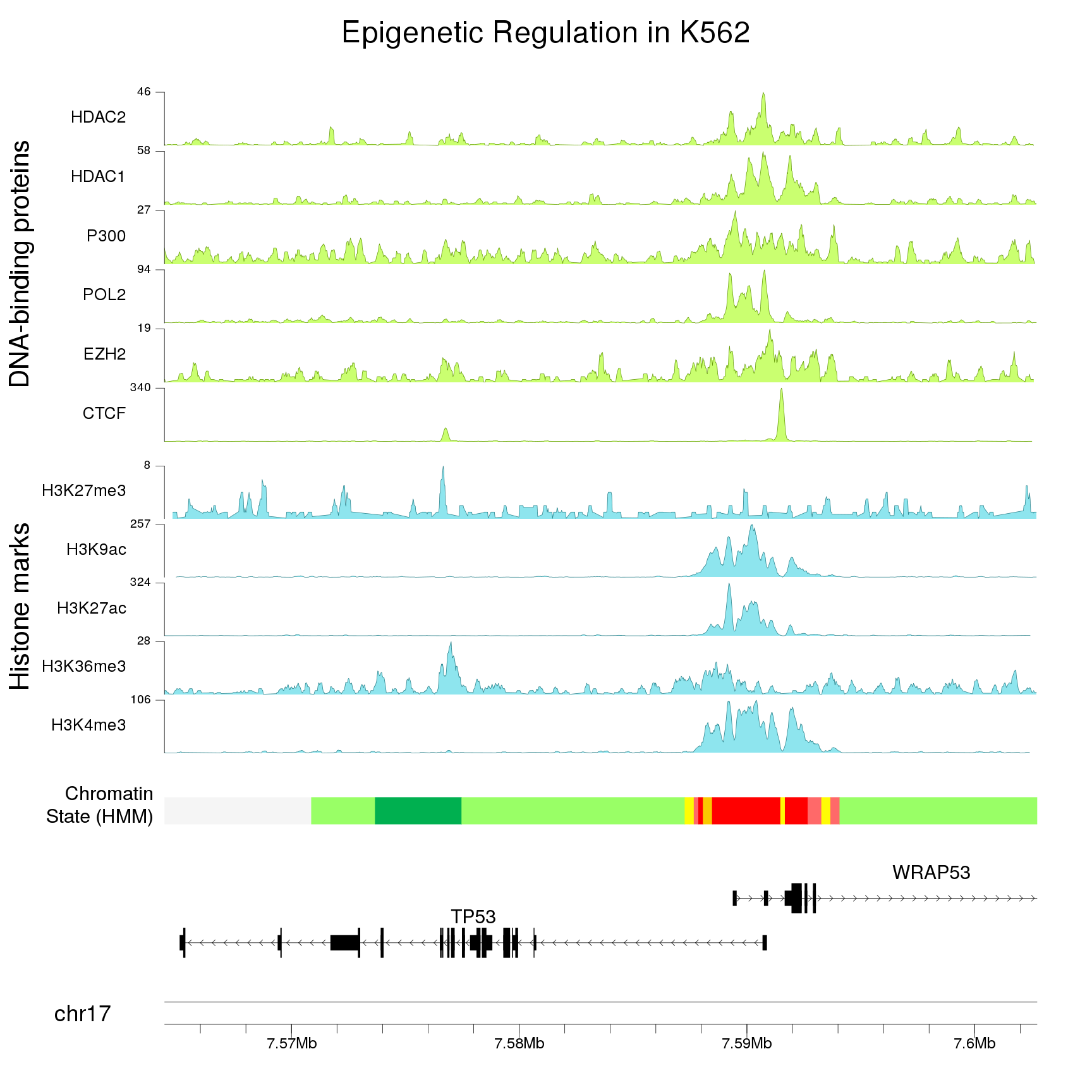
If you would be also happy with non-circular plot, you can try with karyoploteR. It's an R/Bioconductor package and it should be easier to grasp than circos config files.
As Circos, it can represent any data type, including ChIP-seq data and you can zoom in to your regions of interest pretty easily.
This is an example from the karyoploteR tutorial plotting ENCODE data (including ChIP-seq data) around TP53.

Use of this site constitutes acceptance of our User Agreement and Privacy Policy.

