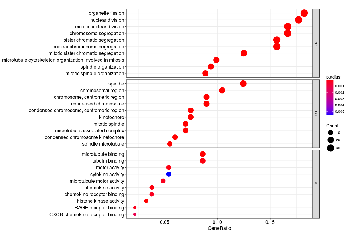
I was trying to plot the gene ontology (BP; CC; MF) terms for a set of genes as shown in the figure below. The codes used to generate the plot is
go <- enrichGO(de, OrgDb = "org.Hs.eg.db", ont="all")
dotplot(go, split="ONTOLOGY") + facet_grid(ONTOLOGY~., scale="free")
However, instead of the gene ontology names (such as organelle fission), I want to plot the GO codes (GO:0048285) on the y axis. Is there any way to do that?
Also, my second question is regarding the x axis. What does "Gene ratio" represent here? Is it the number of genes enriched for that particular term divided by the total number of genes?


